La Monarca
Overview
This project challenged me to conceptualize and design an original tequila bottle, giving me valuable experience in product development from concept to physical production. La Monarca draws inspiration from the monarch butterfly migration between California and Michoacán, incorporating themes of transformation and cultural heritage. Working on this project enhanced my skills in designing for physical manufacturing constraints, understanding print production requirements, and developing a cohesive product display presentation (PDP). The process of bringing my design from digital concept to tangible product provided crucial insights into the realities of commercial packaging design.
Timeline
6 Weeks
Collaborative
No
Software
Illustrator & InDesign
Year
2025
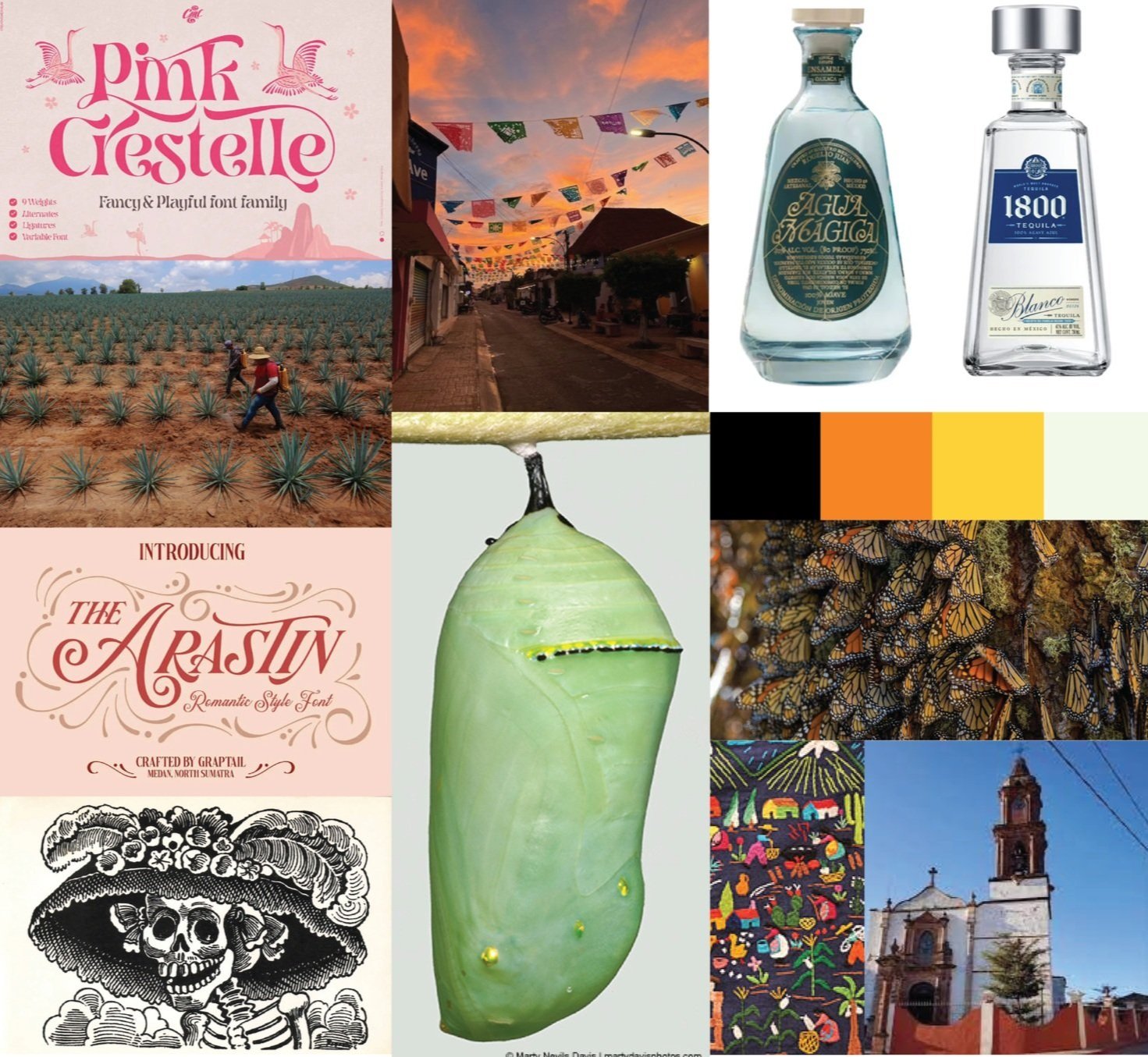
Concept & Mood Board
‘La Monarca’ is a handcrafted mezcal from Michoacán that honors the monarch butterfly migration—a timeless journey mirroring human movement across borders. The design celebrates transformation and resilience, presented with elegance worthy of life’s meaningful celebrations. Each bottle connects indigenous heritage to continuing legacy—a toast to roots and wings, to where we’ve been and where we’re
‘The mood board captures monarch butterflies’ migration journey through cocoon and wing patterns, Michoacán’s landscapes and architecture, and script lettering studies for custom typography development. These elements blend to create a design that honors both natural beauty and cultural heritage while maintaining premium brand character.
Sketches & Ideation
‘When sketching for ‘La Monarca,’ I really focused on creating movement to capture migration. I played with lots of angles in my drawings to show this dynamic feeling. That’s why I went with a tapered, angled bottle shape – it continues this angular language throughout the design. I wanted to balance this with the delicate nature of monarch butterflies, so I sketched various compositions using bows and elegant elements for that expensive, refined look. My sketches also explored different wrapper concepts inspired by cocoons and butterfly wings.
Color Scheme & Logotype
My main inspiration for this design came from the migration journey of monarch butterflies from California to Michoacán. For the color palette, I focused on the distinctive green of a monarch butterfly’s cocoon, which perfectly symbolizes the growth and transformation themes I wanted to express about immigration/migration. I paired this “cocoon green” with stark black and white elements to create maximum contrast, allowing the green to stand out while giving the overall design a bold, sophisticated appearance.
Back Label
PDP & Lay Flats
These layflats showcase the complete packaging design for La Monarca. First are the bottle labels, meticulously designed to incorporate the custom typography and monarch-inspired elements. Second is the wrapper, which extends the visual narrative of transformation through its pattern and form. Together, these components create a cohesive design language that carries the migration story from the bottle itself to its outer presentation, ensuring a premium unboxing experience that honors both the mezcal’s heritage and the butterfly’s journey.
Neck Label
Primary PDP
Wrapper (Transparent)
Secondary PDP
Emblem Sticker


